KP.org: A case study in user experience disaster.
A friend recently sent me an email with screenshots describing KP.org’s workflows for sending a message to a doctor. He was telling me how painful the process is. Of course in my head I thought “it’s 2014…how bad can it be.” After reviewing his screenshots, I wasn’t entirely sure it could get much worse.
How bad? We’re talking GoDaddy 2006 type of bad. Network Solutions (pick any year, ever) type of bad. A total disaster.
Apparently, other parts of KP.org could use some UX review as well, http://www.runango.com/forums/topic_show.pl?tid=186079, but first let’s first focus on replying to a message.
“As a returning user, I want to reply to a message from my doctor.”
Let’s start with the following user story and evaluate the workflow process: “As a returning user, I want to reply to a message from my doctor.” It explains my desire or intent as a user of the application. For those not familiar with user stories, I recommend the book “User Stories Applied” by Mike Cohn. https://www.mountaingoatsoftware.com/agile/user-stories
This is the current workflow process for replying to a message on KP.org:
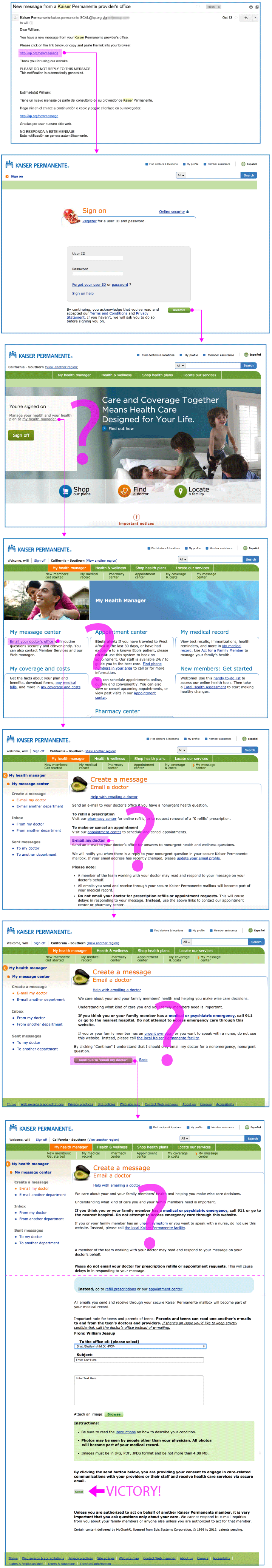
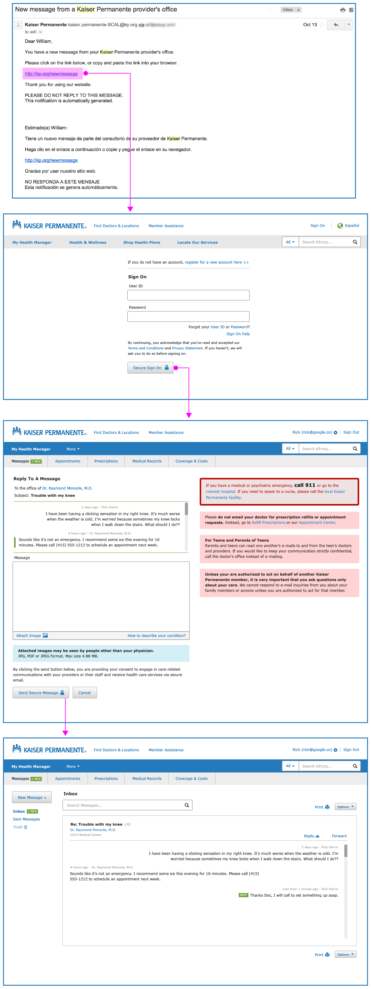
- Receive an email about a new message from my doctor
- Click the email and go to KP.org
- Login
- I’m plopped on the homepage, and it tells me I’m signed on
- Then I have to figure out to click “My health manager” in the top nav (because i’m completely LOST and don’t know what to do)
- Okay, then I click “Email your doctor’s office”
- I land on a page and have no idea what to do. I have to find and click “Email my doctor”
- BUT NO, I’M NOT THERE YET! I have to click “Continue to email my doctor” …again
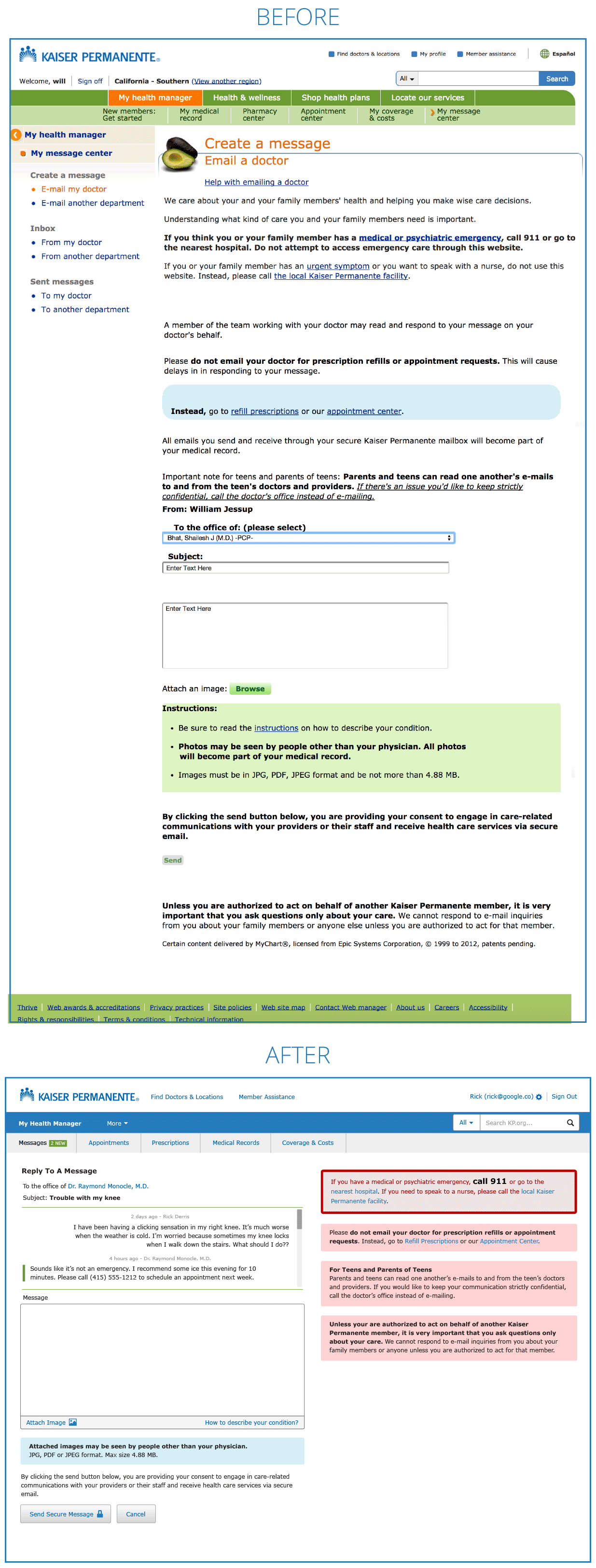
- Now I end up on a page with no message form above the fold, and oodles of disclaimer text (with a wide range of importance)
- Then I need to scroll down and select my doctor from a select menu
- Finally send a message
That’s 11 steps to send a reply message. WOW. I included everywhere I need to pause and figure something out as a step, so let’s say it’s 11-ish steps. But wow, it’s a miracle I even made it through the process.
What the process should look like:
- Receive an email about a new message from my doctor
- Click the email and go to KP.org
- Login
- Reply screen with message form above the fold (with past message history available)
How can the current designs change to provide a more useable experience?
Let’s look at some ‘before and after’ redesign screens for KP.org. For a more detailed understanding of the type of criteria we evaluate for user experience, go here http://uxchallenge.org/user-experience-ux-evaluation-criteria
One thing to note is that Kaiser probably has legal text mandates that must remain intact. As much as we might like to remove large blocks of text to clean things up, I’m sure their legal department would have a lot of things to say about that.
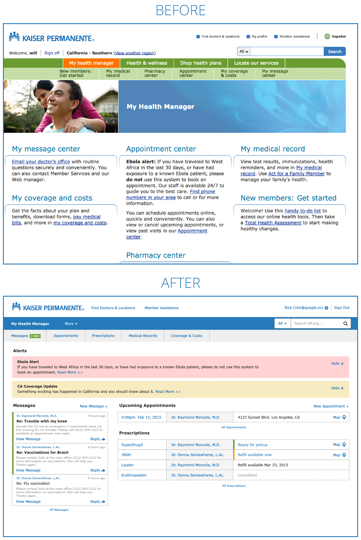
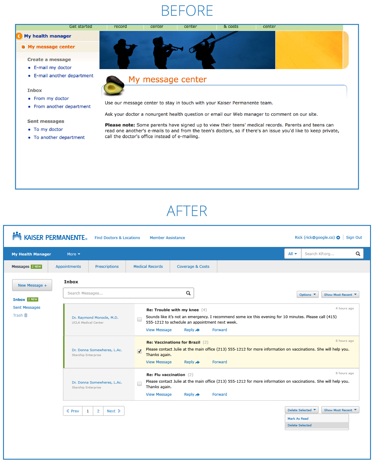
My Health Manager home screen
After I’m a paying customer, I don’t need to be ‘sold’ much more stuff. I don’t need to feel the ‘vibes’ of KP.org. For me as a paying customer, my intent has changed from reviewing plans and information (consuming content) to actually doing stuff related to my healthcare (utility). My Health Manager could be a dashboard with all the relevant utility information I care about: Messages, Appointments and Prescriptions.
Messages list screen
We can replace the messages list with a modern interpretation that is much more informative and useable. With a new interface we can:
- Search messages
- Quick reply or forward a single message
- Bulk edit/delete messages
Send and Reply to Message
To start we’ve moved all the disclaimer and help text to the right column. We also end up with a the form above the fold. We’ve added a special ‘Reply’ view that shows the existing conversation above the form so we have context when replying. We’ve also made the action buttons more visible.