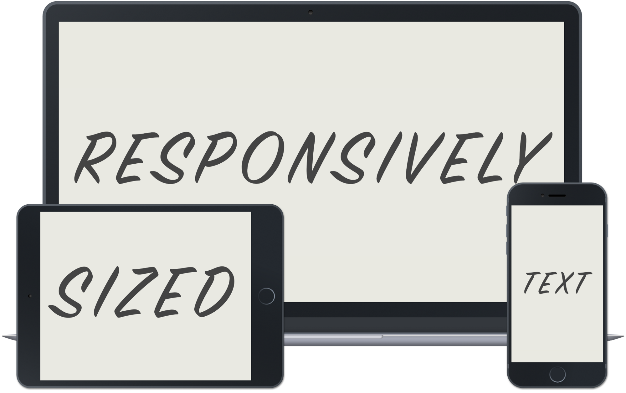
CSS pro tips: responsive font-sizes and when to use which units
With vw and vh, you can have font sizes that adjust to the width of your screen. Here’s how to manage them like a champ.
I’ve been following Heydon’s advice on font-sizes for a while now, and have learned some additional tricks for making responsive font sizes super easy to deal with.
1. The thing that underlies all the others
You don’t need media queries to make different font sizes.
You don’t need many font-size declarations at all.
Mostly, you just need this:
html { font-size: calc(1em + 1vw) }
This gives you all the magic. Font sizes that respond to the device width and look great on all screens. But there are a couple catches, so it’s good to dig a little deeper and
Understand the magic
We are telling the browser to calculate the result of adding 1em to 1vw. Let’s understand what that means first.
The em part: You can think of the em value as being the size the text bottoms out at. If the viewport is 0px wide, then vw is 0, but the font-size will still be at least the em value.
The vw part: The vw value says how responsive you want the font-size to be to the viewport width (1vw is 1/100th the width of the viewport). Adding a high vw will make it pretty responsive — huge text on huge screens, tiny text on tiny screens.
So if you want pretty small text on small screens, you might choose 0.85em as your bottom-out value. And if you want it to grow really big with big screens, you could add 2vw instead of just 1.
Inherit the styles
If you set this on html, you barely have to override it anywhere else. The default browser styles for all headings, h1 through h6, are all pretty good. Here are some defaults:
h1 { font-size: 2em }
h2 { font-size: 1.5em }
Honestly, that’s all I know. That’s all I really need to know.
The 2em means it will be two times larger than the base font size, which is our responsive font size we set on html, which is perfect. 1.5em means it will be 1.5x larger than the base font size. Also perfect. There’s no reason to override these.
Where inheriting gets missed is things like button and input. For some reason, these don’t inherit their parent’s font-size by default. Instead, they default to 12px or some other inexplicable and unresponsive value.
So, override.
button { font-size: inherit }
input { font-size: inherit }
While you’re there, you may also want to make them inherit font-family, as they also don’t do that by default.
2. Use em for everything! Actually, no.
ems are great. They are approximately the size of the letter “m” in the current font! When you set an element’s font-size, it sizes all the em measurements it uses accordingly.
These measurements also apply to the element’s children. That’s why you want to override the base font-size sparingly. If you find yourself doing this, you’re doing it wrong:
.wrap { font-size: 1.5em }
.wrap .title { /* no overrides here, we cool with 1.5em */ }
.wrap .details { font-size: 0.66em }
.wrap .author { font-size: 0.55em }
If you find yourself setting aggressively small em values to override a parent’s unnecessarily large em value, maybe get rid of the parent’s em value. For the above, you probably want this:
.wrap { /* nuthin */ }
.wrap .title { font-size: 1.5em }
.wrap .details { /* .66 of 1.5 is 1, so no resizing needed here */ }
.wrap .author { font-size: 0.8em }
But now note that you could probably use an <h2>for that .title, and you could probably use a <small> for the .author, and then you don’t need any special sizes at all.
So the general rule is, use em for overriding other font-sizes in a relative way, but only when necessary.
px values are still good for other things
I have found at least one area where I don’t want the size of something to be based on the size of the text (or, by extension, the width of the screen). Maybe there are other places where px make sense, too. The one I thought of: border-radius.
I either want
-
No border radius. Pointy corners.

-
Pill-shaped things. The best approach here seems to be to set the border-radius to an unlikely huge number.
border-radius: 1000vh, for example. (Reference)
-
Slightly softened corners. For these, I don’t want the softening to depend on the screen width. I want the same amount of softening, no matter the screen size. So
border-radius: 4pxis great.
Use rem for whitespace. Probably.
I’ve just started to be convinced of this. An example to illustrate the argument:
footer { font-size: 0.8em; padding: 1em; }
The trouble here is that my font-size declaration will make my padding 0.8x the size of the main-page em. And if I want my footer to have the same bounding whitespace as the rest of the page, that’ll look wrong. So instead, I can use this:
footer { font-size: 0.8em; padding: 1rem; }
Now, this only works because we set the main, page-wide font-size on the html element! If we had set this:
body { font-size: calc(1em + 1vw) }
instead of this:
html { font-size: calc(1em + 1vw) }
everything else in this post would work, but rem units would be calculated incorrectly!
Now, does it always make sense to specify margin and padding in rem? It might!
I’ll be trying this out, taking it case-by-case. To decide between em and rem, think about this: do you want the whitespace around your element to conform to the page or the element itself? For footers and other containers, you probably want rem. For p and h2 tags, you probably want em. (But you don’t need to override browser defaults for p and h2 tags much, so em whitespace might not come up much either.)
Final thoughts
Thinking in relative sizes takes some getting used to, but it can make simple pages that are gorgeous on every screen, with minimal CSS to maintain or screw up.
Definitely check out Heydon’s article, Writing Less Damn Code, for other great tips.